SAP Fiori for iOS Design System
SAP, 2016 - Present
SAP Fiori for iOS is a design language/system to create native iOS enterprise apps for business users. It provides the design guidance and SDK for designers and developers to easily create and build modern role-based business mobile apps.
I started as an individual contributor to some components then played the role of the design lead to drive the direction of design and documentation of the design system.
Process
Design exploration
We started discovering the design system with designing iOS apps for four SAP core industry products, Asset Manager, Project Companion, Sales Advisor and EMR. I worked on Project Companion app and Sales Advisor app. With the real use cases, data and problems, we aimed at identifying the reusable components that appear across the four apps and making sure the components meet the needs for different use cases. Starting from product design, we were able to design a system that best meets business users’ needs in all kinds of use cases.
Additional, we successfully established the foundation of the design system, including colors, typography and iconography.
UI components & Patterns
In this step, our goal is to unify the reusable components and create an extensive suite of components and patterns that can serve all the business use case. To achieve the goal, we took a step back to define the anatomy of elements with the components and the eventually design the UI components and patterns by considering all the variations, states, edge cases, adaptiveness as well as accessibility. We have defined a lot of business specific UI components, such KPIs, Timeline, Object Header and Analytics.
I worked on the controls for Create, Filter, Filter Feedback, List Report and Data Table and lead the design of several critical topics such as analytics and map.
UI components library: Sketch symbols
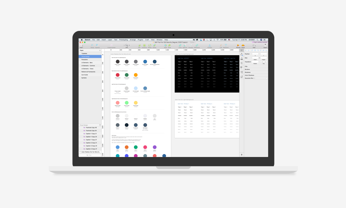
I created the adaptive library of UI components in sketch. The sketch stencils allowed the team of product designers to quickly produce the UI mockups using the consistent and pixel-perfect sketch symbols. In this way, they could focus on solving the app problems without worrying about the visual treatment of the UI components.
We have received very good feedback on the design stencils from the designers for the thoughtful setup and broad coverage of variations. Read my learnings about creating the UI components library here.
Documentation: Design guidelines
We documented the guidelines, interaction behavior, examples as well as design specs for all components and patterns in our design guidelines website to share with other product designers who design with SAP Fiori for iOS.
I was responsible for all the content on this design guidelines, including the information architecture and all the articles written by the designers on the team.
Implementation: SDK
We closely collaborated with our SDK development team to implement the UI components to enable developers to easier build the apps. Besides providing the detailed design specs for each component, we worked with developers to stress test the components and test the build to make sure the components deliver the best user experience. I used Jira to track the progress of implementation and designed a collaboration model for design team to sigh off the implementation.
Enhancement
We are still enhancing the design system by learning about the user feedbacks, new use cases as well the platform capabilities. On top of that, we are trying to add more UI components to the system so that it can serve more business use cases and users.


