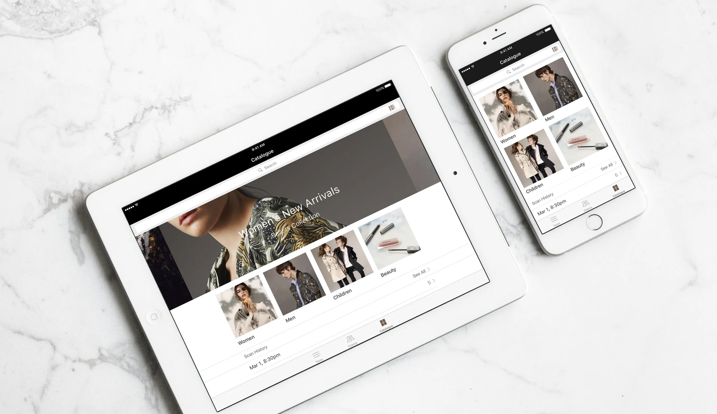
Retail Clienteling App
iOS app design for a luxury brand store

SAP, 2017
Retail Clienteling app design for a luxury brand
Background
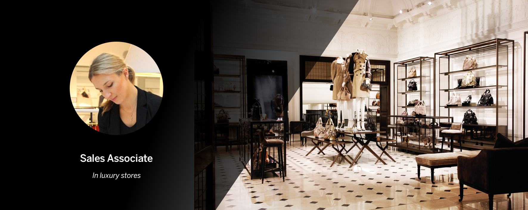
This project was to assist our partner to design a clienteling app for sales associates in luxury stores. To speed up the design process and decision making with all stakeholders, a 5-day workshop was done together with end users, customers, developers, and business partners. I was the UX/UI design lead working with UI designers from partner side. Although most of the design was done during the workshop, this is a real product design instead of concept design. The app was designed for both iPhone and iPad. To start with, we focus on iPhone app design during the workshop and have the designer from partner side to continue the work and transform the design for iPad after the workshop. The development team of partner managed to deliver the MVP to customers.

The Challenge
As a daily tool for Sales Associates, this app should work as a task manager to finish their client related tasks. It is the ‘black book’ that keeps track of their interactions with clients. It is also a product catalog to look for products and check for stock information. This is not a complicated use case, however, managing all the information and providing a clear navigation throughout the app were the most challenging part of the project. According to the research that has done before the workshop and the user validation during the workshop, above are the four aspects that we addressed while designing.
Regarding other constrains, limit of time was another challenge for us. After prioritizing the work and agree on the flat navigation style, we decided to spend each day on one tab of the app and focus on the key screens.
Client Profile
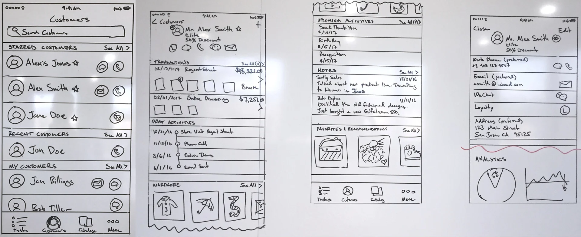
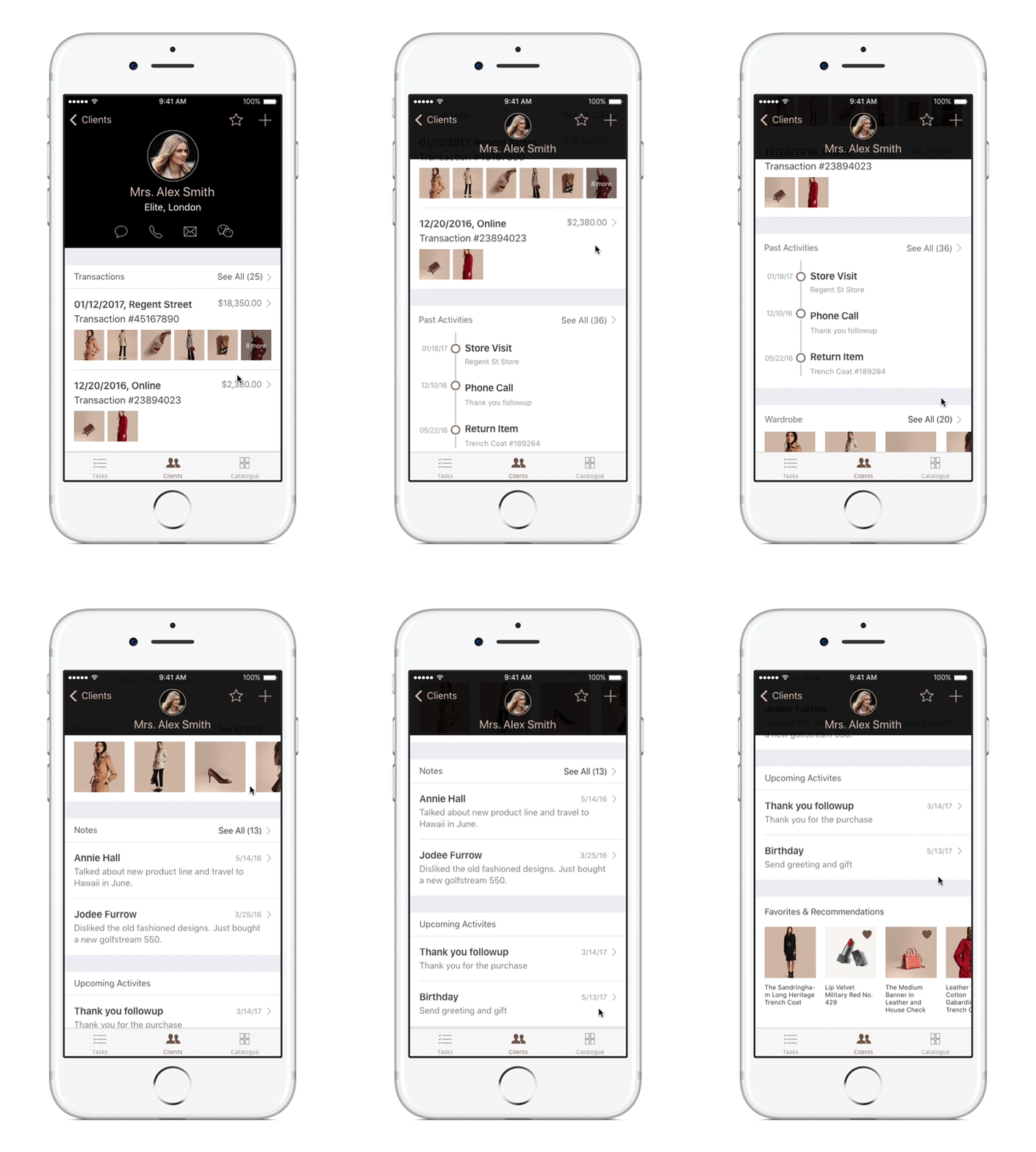
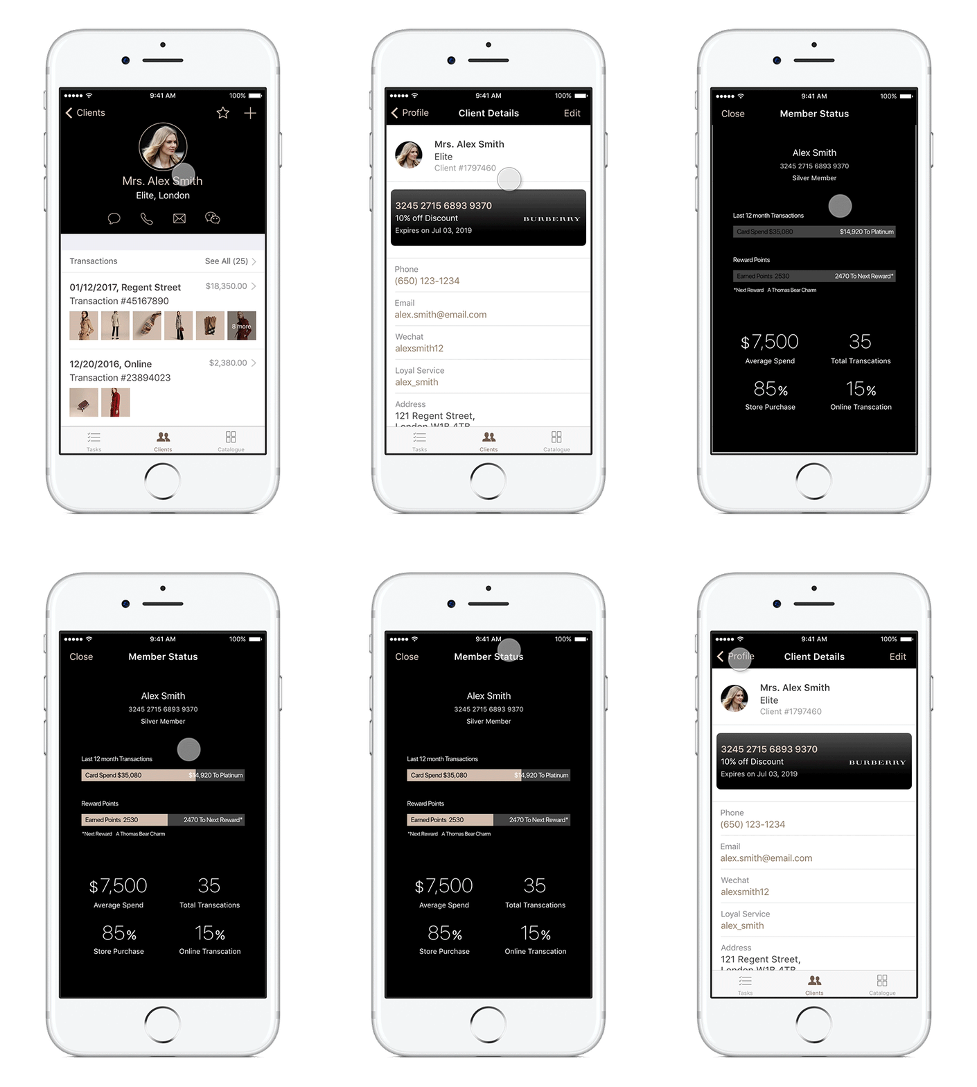
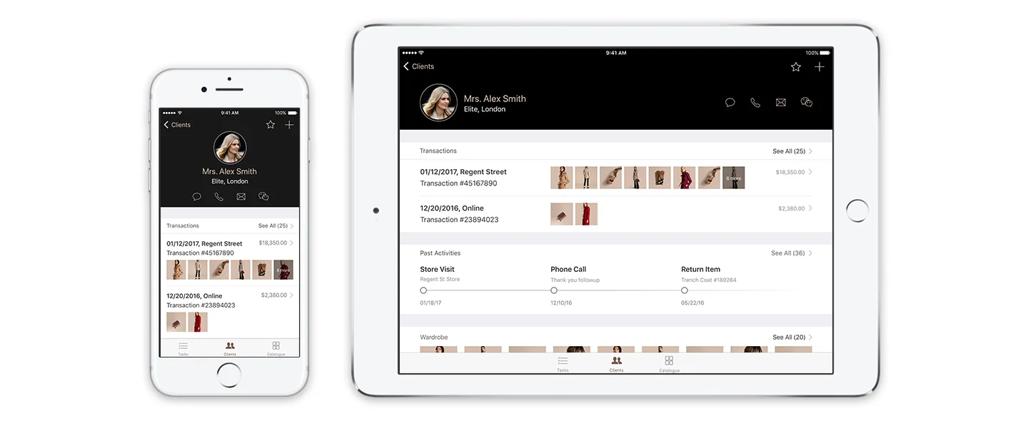
Client Profile provides a lot of information around the client, such as the purchase history, client's past interaction with sales associates and product recommendations to the client. Sales Associates also need to access the client’s personal info for contact and other activities. To reduce the noise and design a better information hierarchy, we surfaced up only the most important information and primary actions on Client Profile screen.
Private Profile
Private profile contains the contact information and membership status of the client. Sale Associate can edit or update client profile and check the spending ability of a client. This profile can be locked when the client is a VIP, such as celebrities. Only the admitted user can unlock the private profile by using TouchID.
Tasks
How to help sales associates focus on today's task and customer appointments without ignoring the planned tasks for the month?
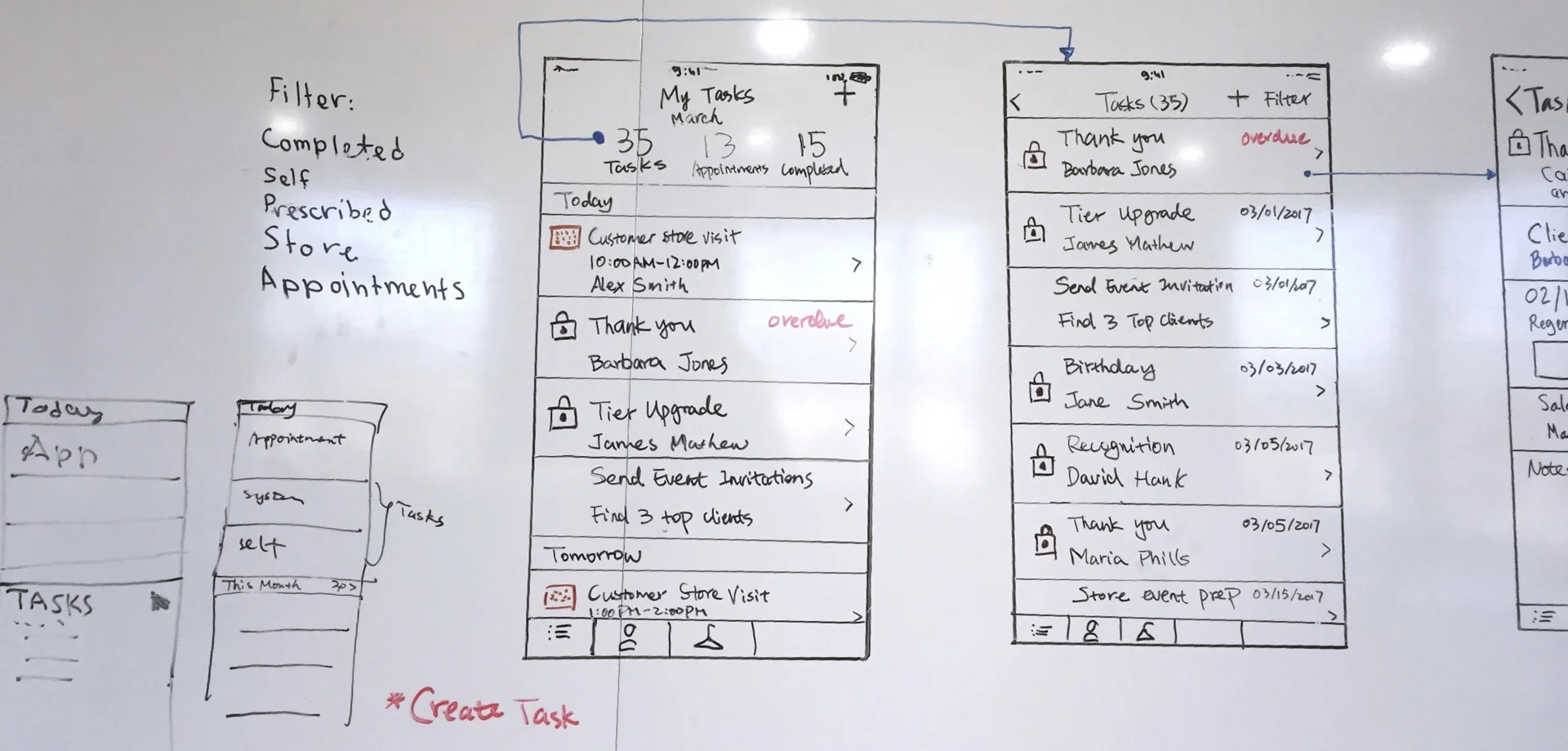
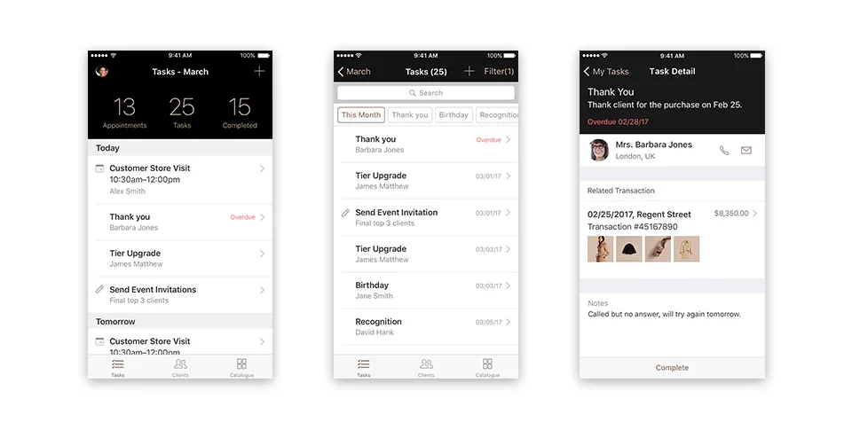
The system periodically assigns the clienteling tasks, such as thank you follow up, tier upgrade and birthday greeting, to the end users. In addition, the store manager or the users can create task or client appointment for themselves. We designed a list with appointments showing above all the tasks on a daily basis. There's an edit icon to indicate non-system tasks. The KPIs on the header shows the total task numbers for this month so that the user can expect how busy they will be. The number of completed tasks provides a sense of accomplishment to the users. By tapping on the KPI, the users are able to see the list of tasks/Appointments filtered by this month. On the task detail screen, related customer and transaction info gives the users the context of the clienteling task. The user can contact client directly from here and add notes of interaction to this task.
Product Catalogue
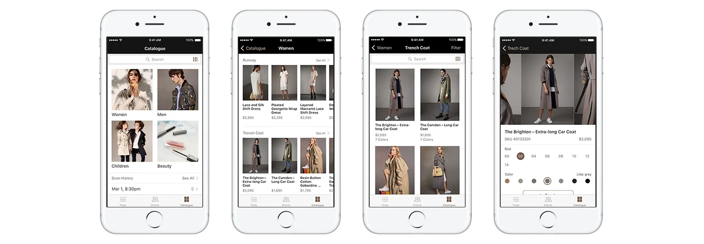
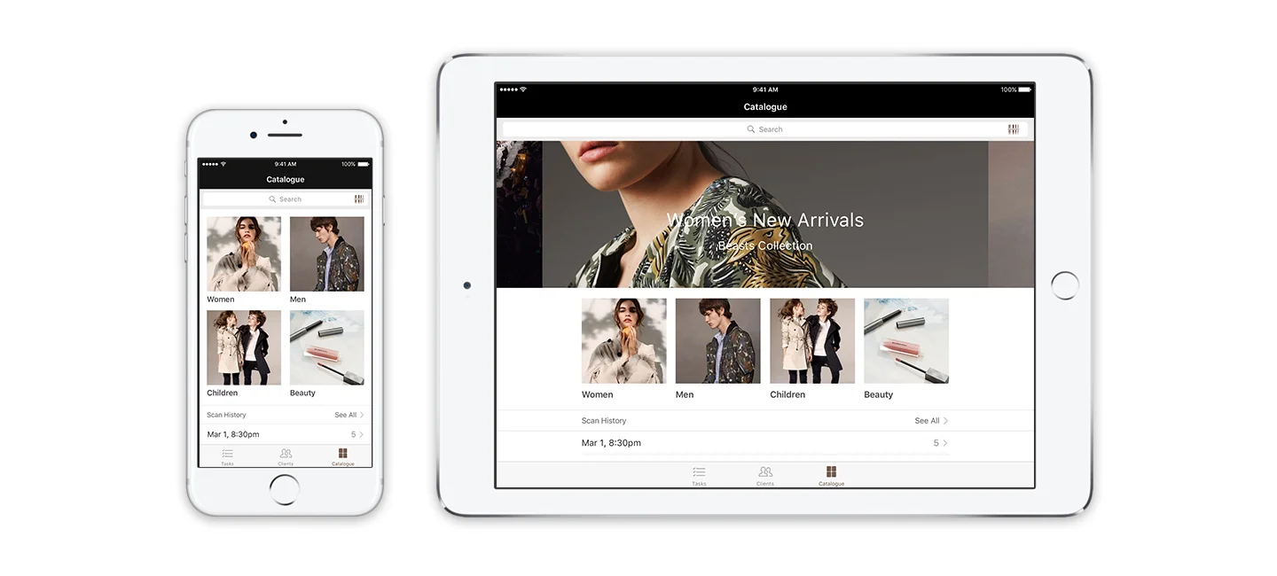
Unlike a Product Catalogue for shoppers to browse, the Catalogue for Sales Associate is all about quickly locate the product and check stock availability for customers. The biggest challenge here is to solve the navigation problem. Due to the difference of categories, it is not efficient to show all the products here and use filters to narrow down the products. To rethink the problem, we considered the possible scenarios of using this product catalogue. One is when user needs to look up for a particular item to check the stock info. To address this need, the search bar with a scanner is integrated on the screen. Another scenario is to look for similar products when the user need to do recommendation for the clients. That means they only need to see the products under the same sub category. We designed the drill downs for the user to see the previews of each category and then provide filters within the category to make filter size much smaller and efficient.
Product Scan
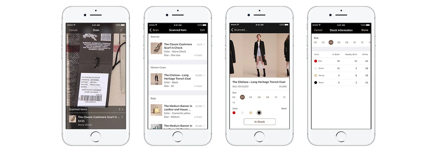
By talking to the users, we found that unlike retail stores that put everything in the floor, Sales Associates normally need to go to the back house to get items when the client asks for a size or a color for the items. And this can be hard for Sales Associate to remember when there are several items. To address this, we came up with the concept of using the scanned items as a list for the Sales Associates to help prepare the products. The app also keeps the scan history and even assign the records to clients so that the Sales Associates can always find what customers have viewed.
Adaptive design
After the workshop, I played the design consultant role to assist designers from partner side convert iPhone design into the iPad app. Considering the screen size and the device orientation, the UI components are more horizontally stretching out on iPad than that on iPhone.
What I Would Have Done Differently
Overall, the most part of the design succeed to achieve the goals. However, there were some part that need further user testing and validation. For example, the checking stock workflow. We were struggling to figure out either showing all the stock info on product detail screen or hiding them in another screen. Another key workflow I wish I would have done differently is the New Client screen. We designed a very basic create screen during the workshop, however, what we learned later was that clients may need to fill out the form. To achieve that, the clients need to be involved in the research process and their needs should be addressed as another user party of the app. As an important touch point of the whole brand experience, the New Client screen has a lot of potentials to be more engaging.